Designing a “visual thread” to connect Boston’s creative voices.
The Challenge
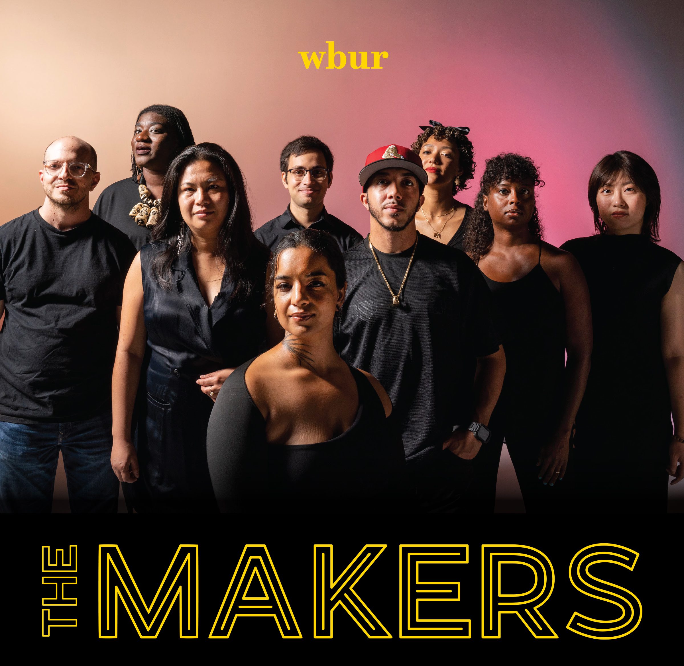
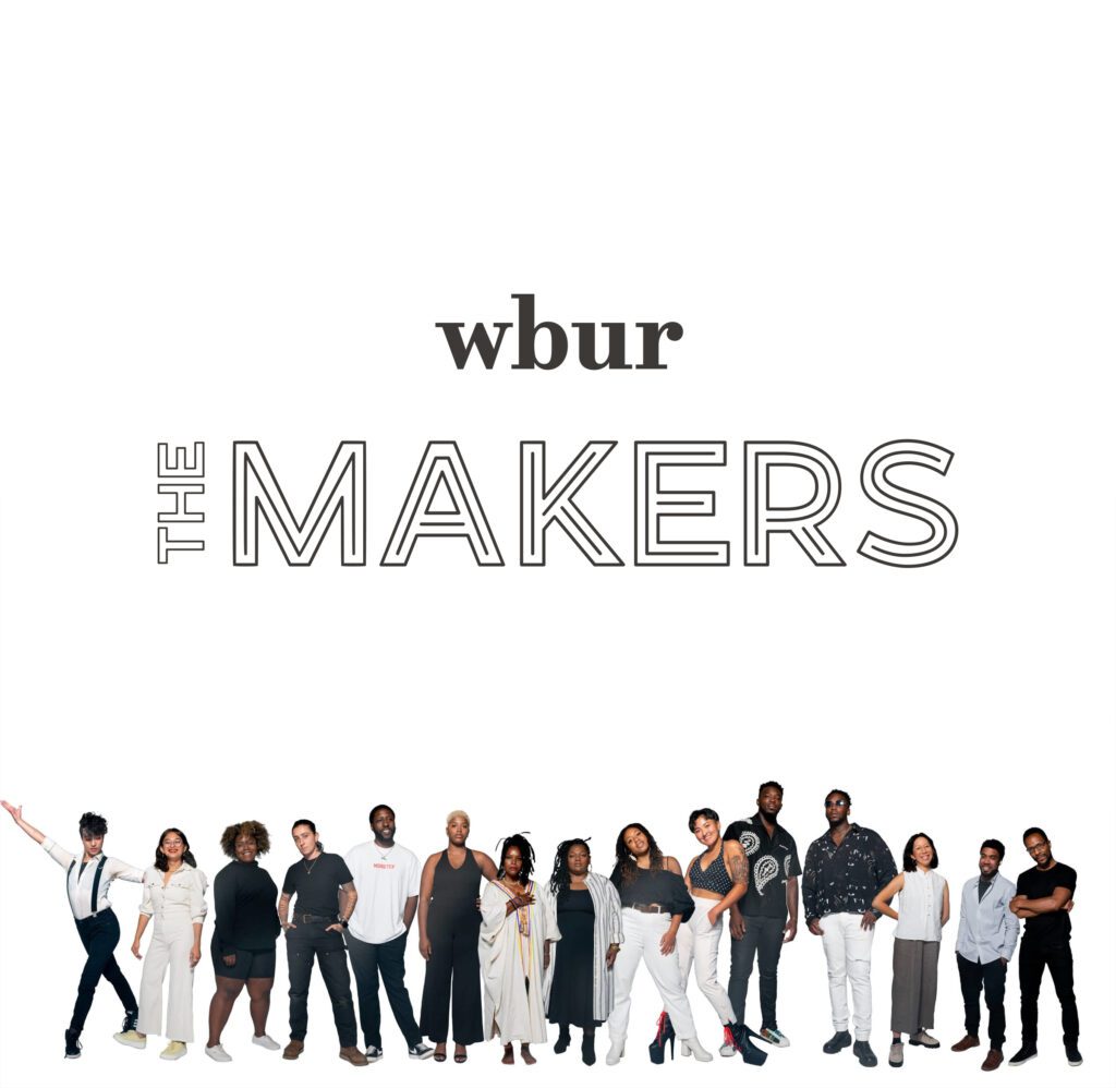
The Makers is an editorial series featuring everyone from metalworkers to poets. The visual identity needed to feel as “hand-crafted” as the subjects themselves, yet remain structured enough to live within WBUR’s digital ecosystem. The core tension was creating a system that celebrated individual personality without fragmenting the series brand.
The Strategy: “The Living Framework”
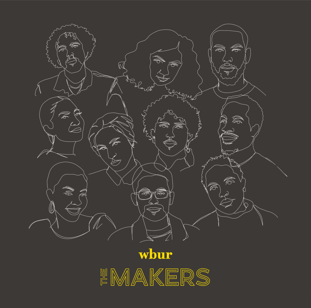
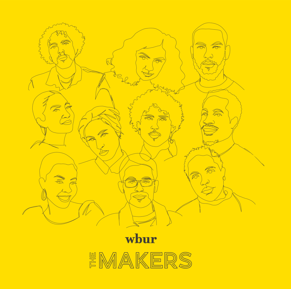
I developed a custom wordmark and an “illustrative kit” designed for high-contrast versatility. By using bold, expressive linework and a modular color system, I created a framework that shifts to match the tone of each artist while maintaining a recognizable WBUR “anchor.” This allowed the design to feel like an organic extension of the storytelling rather than a decorative overlay.
My Role
Visual Strategy: Designed a custom wordmark and a repeatable illustration framework.
Editorial Integration: Partnered with producers to ensure layouts worked seamlessly across mobile and desktop platforms.
Asset Management: Built a library of graphic shapes and textures to allow for fast, cohesive episode launches.
The Impact
The system established The Makers as a distinct visual destination within WBUR. It gave the series a “premium editorial” feel that respected the artists’ work while reinforcing WBUR’s commitment to the local creative economy.
