

Humanizing complex technical narratives through a high-contrast, pop-culture-inspired visual language.
The Challenge
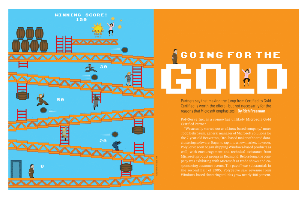
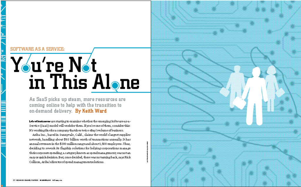
Technical journalism often struggles with information density, where abstract concepts can feel dry or inaccessible. My goal was to inject personality into every issue without compromising editorial integrity. I developed a “visual shorthand” to translate complex topics — such as data security and software architecture — into vibrant, narrative-driven imagery that resonated with a modern, tech-savvy audience.
The Strategy: “The Lifestyle Lens”
I moved away from literal technical diagrams toward a metaphor-driven editorial style. By applying a bold, flat-design aesthetic characterized by saturated palettes and heavy linework, I focused on high-level conceptualization: distilling complex feature stories into singular, iconic “hero” images that acted as an entry point for the reader.
My Role
Visual Identity & Style Development:
Established the signature high-contrast “flat-art” aesthetic, ensuring total visual consistency across print and digital platforms.
Conceptual Execution: Directed and illustrated 10+ multi-page feature stories and primary cover art, transforming technical data into narrative-driven artwork.
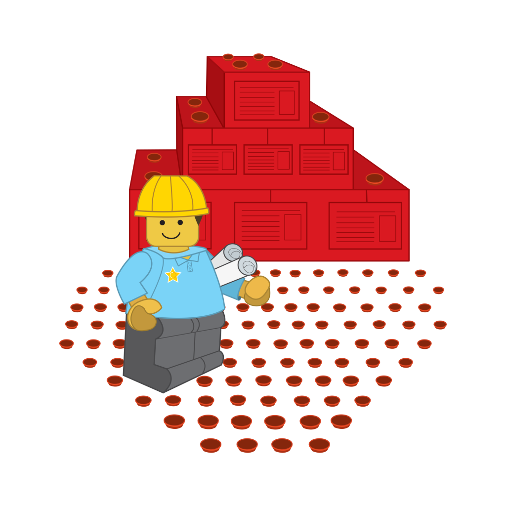
Systemic Design: Created a modular library of spot illustrations to break up long-form text, improving reader retention and navigating “how-to” guides.
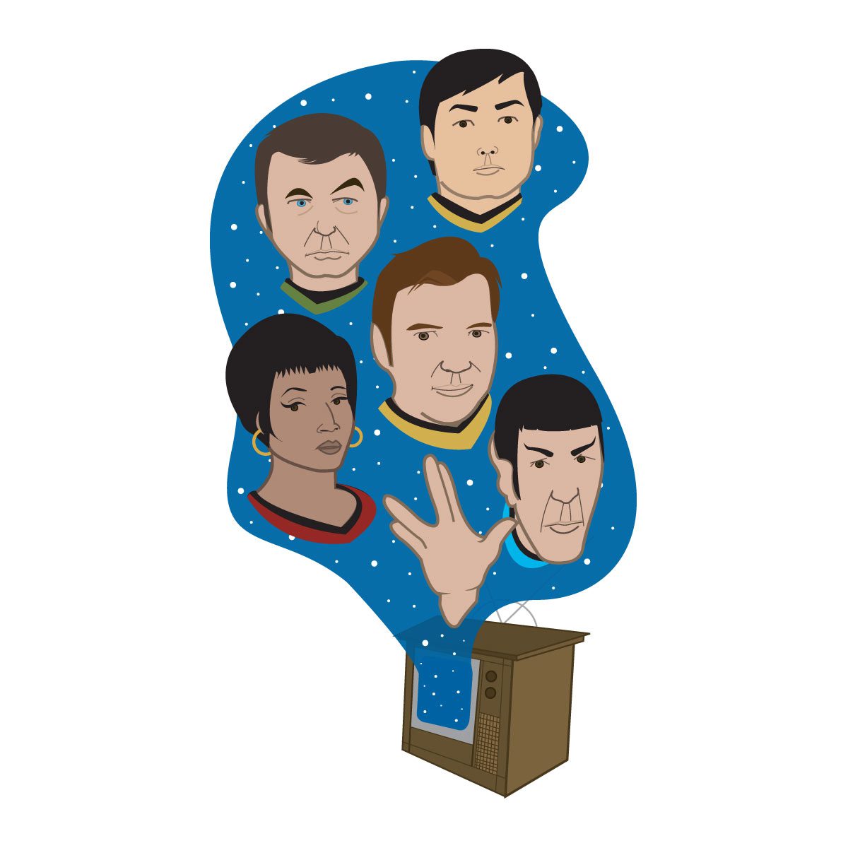
Brand Humanization: Reimagined the publication’s masthead by designing custom, stylized portraits of the editorial team, unifying the brand’s internal voice with its outward aesthetic.
The Impact
The result was a distinct, “illustrator-led” brand identity that differentiated the publication in a crowded technical marketplace. This bold visual direction successfully translated specialized expertise into a captivating lifestyle experience.

