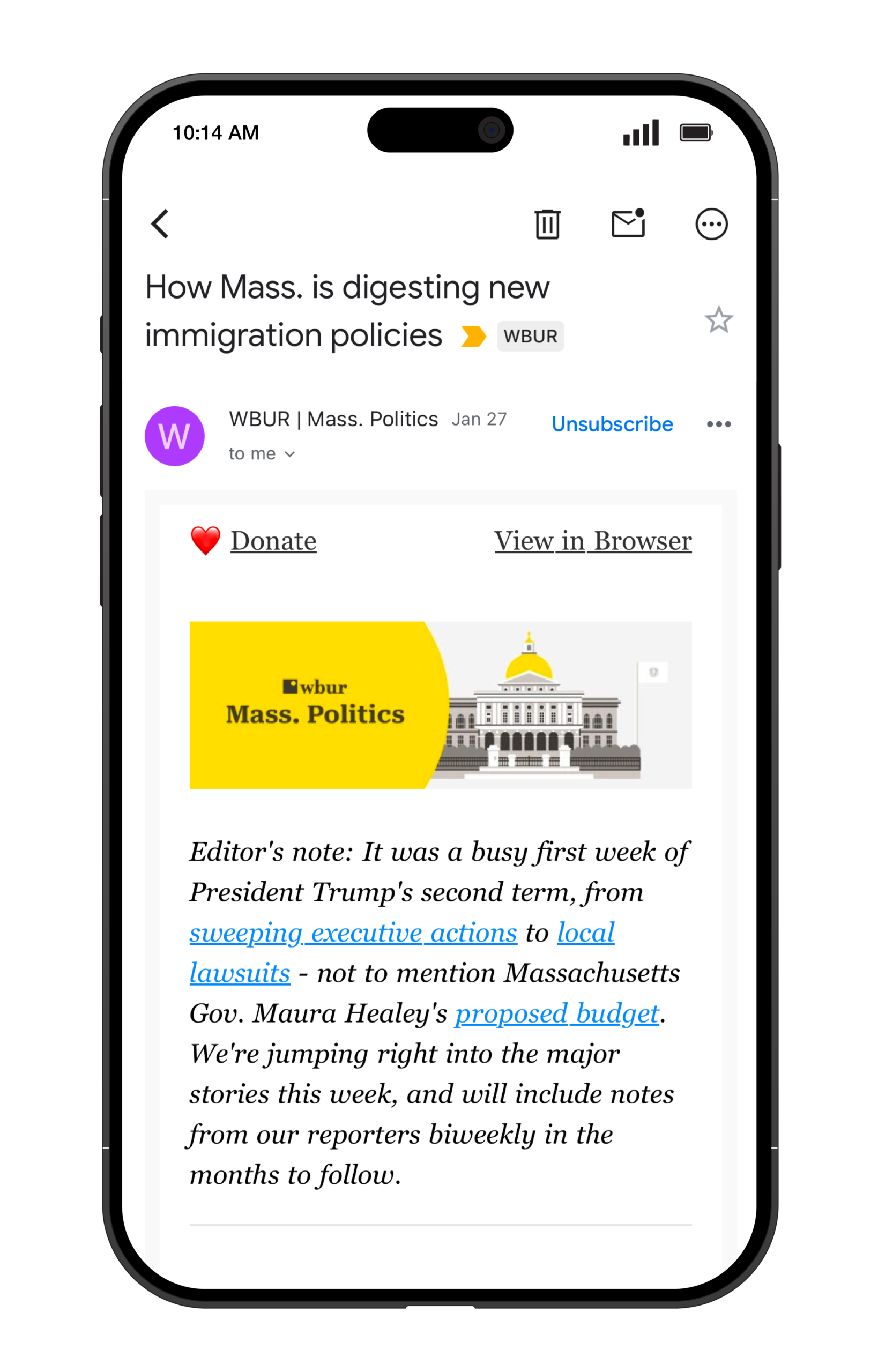
WBUR Events Newsletter Re-Design

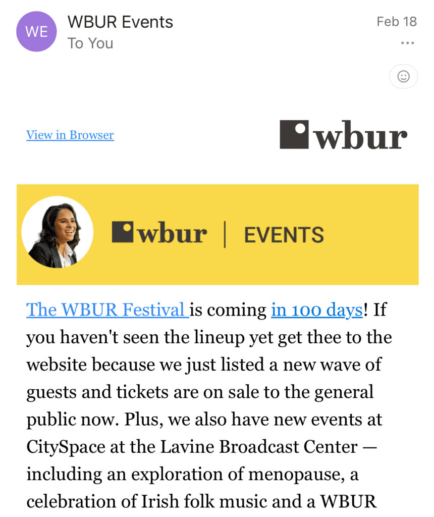
I refreshed the WBUR Events newsletter to align with the core brand palette while modernizing its community-focused aesthetic. By transitioning the static profile images into a dynamic animation, I cleared visual clutter and created “breathing room,” resulting in a high-energy header that prioritizes both brand consistency and motion.
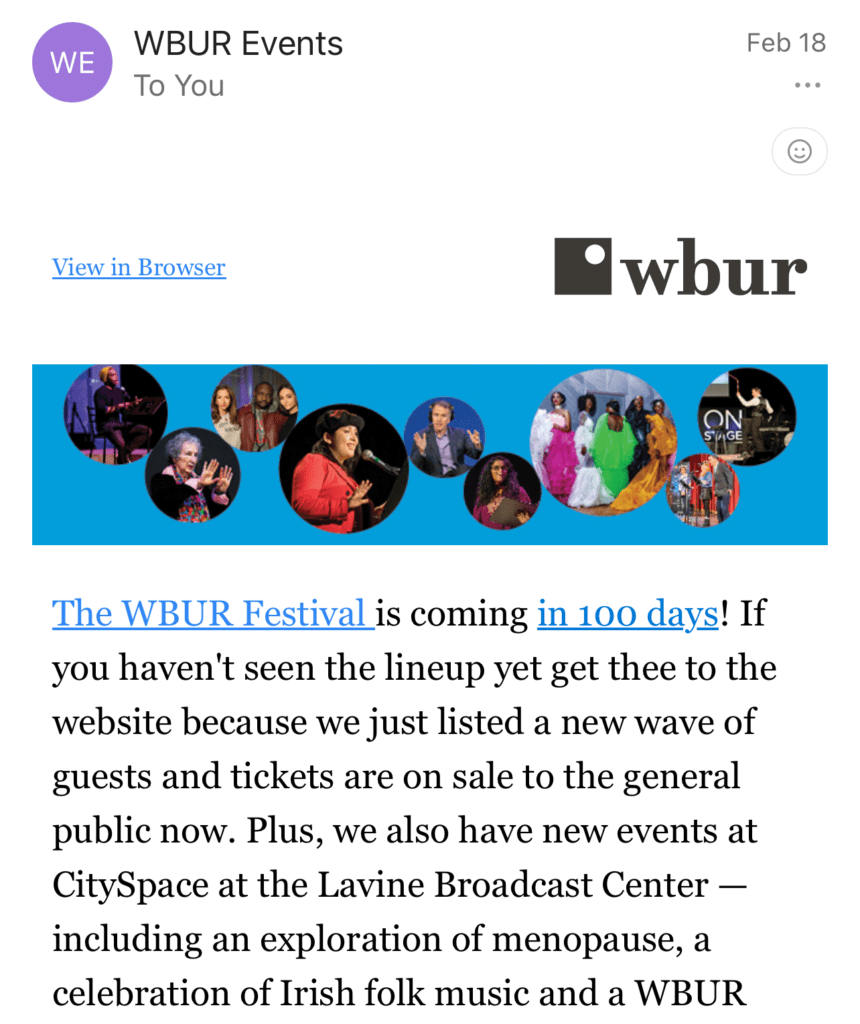
WBUR Mass. Politics Newsletter Re-Design

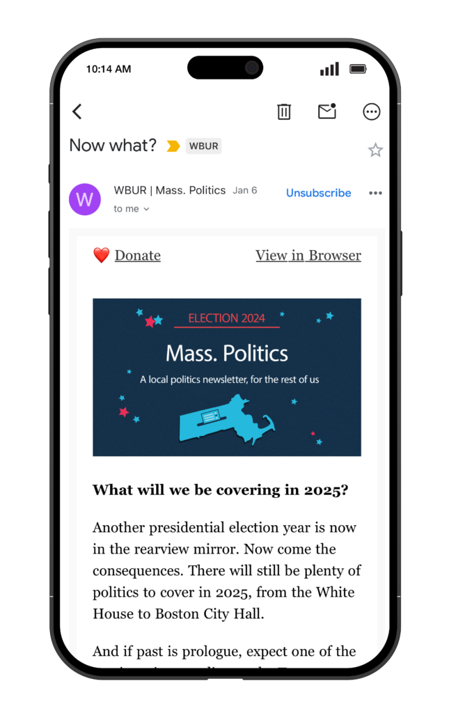
I redesigned the Mass. Politics newsletter header to bring it into brand color alignment while elevating its visual storytelling. By replacing a generic state map with a custom illustration of the iconic gold-domed State House, I created a more sophisticated, site-specific tie-in that feels both authoritative and uniquely tailored to the beat.


Strengthening brand equity through a modular refresh of a high-volume email portfolio.
The Challenge
WBUR’s diverse newsletter portfolio — spanning news, arts, and local interest — had evolved into a collection of highly bespoke designs. This “visual fragmentation” weakened the parent brand’s recognition and created production bottlenecks. The challenge was to architect a system that felt like a cohesive family while preserving the unique editorial “soul” and audience connection of each individual newsletter.
The Strategy: “Cohesion Through Frameworks”
I moved the newsletter branding from isolated designs to a unified architectural framework. By auditing the existing portfolio, I identified core visual anchors —typography, grid structures, and illustrative style — that could be standardized. This “shared DNA” approach allowed for modular flexibility: the headers now share a consistent WBUR brand foundation, while utilizing a variable color and illustration system to signal the specific editorial focus of each product.
My Role
Systemic Audit & Strategy: Evaluated the full newsletter ecosystem to identify visual drift and established a new hierarchy for brand-to-sub-brand relationships.
Illustration System Design: Developed an adaptable, brand-aligned illustration style that could be customized for diverse themes (e.g., hard news vs. lifestyle).
Cross-Departmental Collaboration: Partnered with editorial leads to ensure the refreshed visual identity resonated with established reader expectations and content goals.
Operational Scalability: Engineered standardized templates to streamline the handoff process and ensure long-term design consistency for future newsletter launches.
The Impact
The refresh transformed a fragmented ecosystem into a strategic brand asset. By streamlining the design language, I improved visual recognition across WBUR’s digital touchpoints and significantly reduced the design debt associated with maintaining bespoke headers. The result is a sustainable, scalable framework that allows the editorial team to launch and iterate with confidence.

